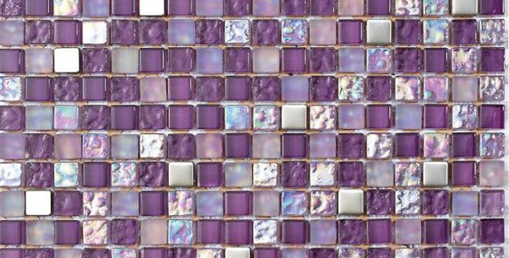
Pairing Tiles with Pantone Spring 2016 Top Colours

Colour is a force that can unite a home, or make it look drab and dreary. And while your home will last a lifetime, its décor will inevitably evolve. Keeping abreast of trends in interior design means looking at what designers are doing, as well as checking out the colours and looks that manufacturers are pushing each year.
In spring 2016, Pantone published its fashion colour report, and it gives us some clues as to the way people are looking at colour in their lives, and in their homes. For a contemporary look, following Pantone's lead is not a bad idea, when you consider they've been working with colour for more than 50 years.
Top 10 Colours
Over the last few years, we've seen a rise in the trend of neutrals in home design, with greys and pale creams being very popular. Now, Pantone is highlighting some altogether different shades.
Dubbed 'a unisex pallette', the spring 2016 collection includes Peach Echo, Snorkel Blue, Serenity (another blue) and Green Flash, to name but four. It's a veritable pick 'n' mix of some of the brightest and most summery colours in its portfolio, and the full selection reminds us of beach huts and ice cream parlours.
So how can you pair these varied colours with the tiles in your home? The answer is to contrast carefully, and avoid going overboard with your selection. While plain tiles have supported neutral colour combinations well, the key here is to pick a highlight colour with accents in your tiles. This gives you the most on-trend combination for your home, without being overwhelming.
Muted or Lively?
Within Pantone's spring 2016 selection, we instantly see some muted tones that would work well in the bathroom. Serenity, Snorkel Blue and Lilac Gray contrast well without being too dark, and would provide a splash of colour in an otherwise fairly monochrome room.
In the kitchen, you can dare to be different: team your Iced Coffee with Fiesta tiles, or go all-out with the beach theme, and put Snorkel Blue with Buttercup. Yellow and blue sounds strong, but if you choose your tiles carefully, you can provide a splash of accented colour while maintaining a classy appearance.
Green Flash is perhaps the most difficult colour in the set, as it's bold and confrontational: Pantone says it "calls on its wearer to explore, push the envelope and escape". We'd agree, but be wary of tiling an entire room bright green. Instead, go for a mosaic tile that combines strong greens with paler tones.
Pulling it Together
When you're choosing windows, doors and other items for your home, consider using Pantone's suggestions to pull in unusual splashes of colour. You can order most uPVC and aluminium windows in a range of RAL colours, and you can easily convert Pantone to RAL using this free online tool.
If new windows are out of your budget, don't neglect this idea completely. A splash of Serenity around a roof lantern helps to tinge the natural light sky blue, while Buttercup painted around the edge of bifold doors will give your garden a sunny outlook.
Most Recent
As an iconic trend that has remained much loved by many for decades, the charming appeal of classic English country homes continues to circulate throughout leading home and lifestyle magazines, and as...
Spiking in popularity over recent years, the rustic bathroom trend is a modernised progression from much-loved shabby chic interiors, taking on the appeal of using worn raw materials (such as wood and...
Hot on the horizon for upcoming interior trends is the return of vintage bathrooms, with many homeowners now looking to inject their space with timeless character.From small decorative accents such as...
Archive
- April 2024
- March 2024
- February 2024
- January 2024
- November 2023
- October 2023
- September 2023
- August 2023
- July 2023
- June 2023
- May 2023
- April 2023
- March 2023
- February 2023
- January 2023
- December 2022
- November 2022
- October 2022
- September 2022
- August 2022
- July 2022
- June 2022
- May 2022
- April 2022
- March 2022
- February 2022
- January 2022
- December 2021
- November 2021
- October 2021
- September 2021
- August 2021
- July 2021
- June 2021
- May 2021
- April 2021
- March 2021
- February 2021
- January 2021
- December 2020
- November 2020
- October 2020
- September 2020
- August 2020
- July 2020
- June 2020
- May 2020
- April 2020
- March 2020
- February 2020
- January 2020
- December 2019
- November 2019
- October 2019
- September 2019
- August 2019
- June 2019
- May 2019
- April 2019
- March 2019
- January 2019
- December 2018
- November 2018
- October 2018
- August 2018
- July 2018
- June 2018
- May 2018
- April 2018
- March 2018
- February 2018
- January 2018
- December 2017
- November 2017
- October 2017
- September 2017
- August 2017
- July 2017
- June 2017
- May 2017
- April 2017
- March 2017
- February 2017
- January 2017
- December 2016
- November 2016
- October 2016
- September 2016
- August 2016
- July 2016
- June 2016
- May 2016
- April 2016
- March 2016
- February 2016
- January 2016
- December 2015
- November 2015
- October 2015
- September 2015


