Styling Trendy Subway Tiles
It will probably not come as much of a shock that the subway tile was originally designed for New York City subways. Designers George C. Heins and Christopher Grant La Farge created the distinctive rectangles for the very first station of New York's then brand-new subway in 1904.
Following the debut of the shiny white rectangular tiles in the subway, they began to appear in bathrooms and kitchens and have been a popular choice for many homeowners and designers for years.
At Real Stone & Tile, we love these tiles and many of our customers enjoy designing their homes with them as they are very versatile. We know that they will be around for years to come, so why not incorporate them into your next project!
In this blog, we have shared some tips and inspiration on making subway tiles shine in your home.
Classic staggered stack
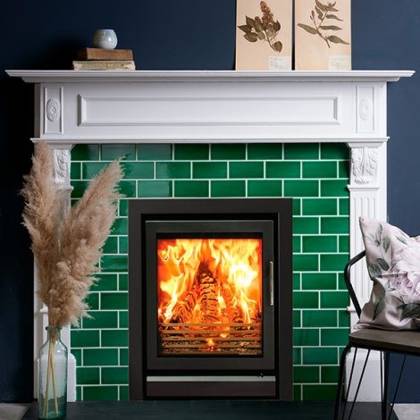
The classic subway tile pattern arranges tiles in staggered horizontal rows. For subtle interest, consider using glass subway tiles in this traditional arrangement. The reflective properties of glass will make your room look bigger, brighter, and all-around more divine. You can also jazz up the classic subway tile pattern by choosing a coloured grout. For instance, pair black grout with white subway tile for a striking contrast, perfect for a modern kitchen backsplash.
Below, you will see how Ca' Pietra's Lyme Ceramic Metro Emerald Green tile enhances this fireplace surround.
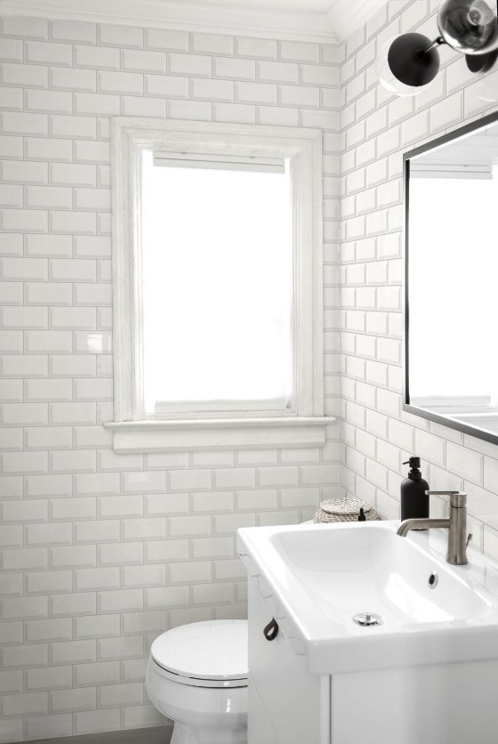
For a clean, classic look in the bathroom, take a look at this all-white bathroom from Marazzi.
Vertical stack
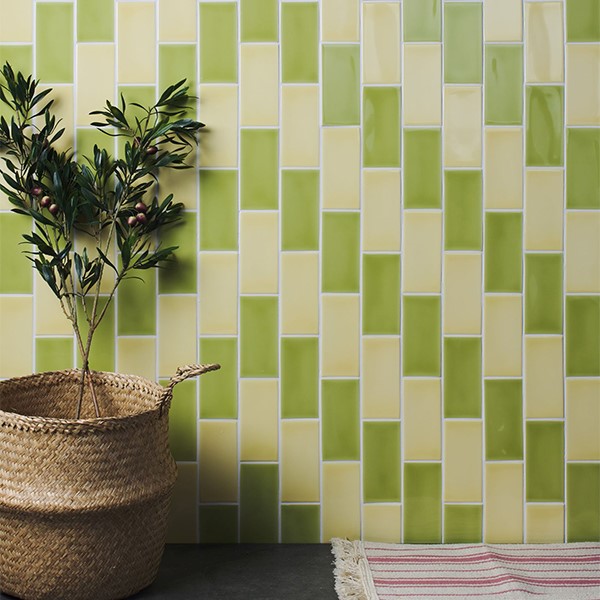
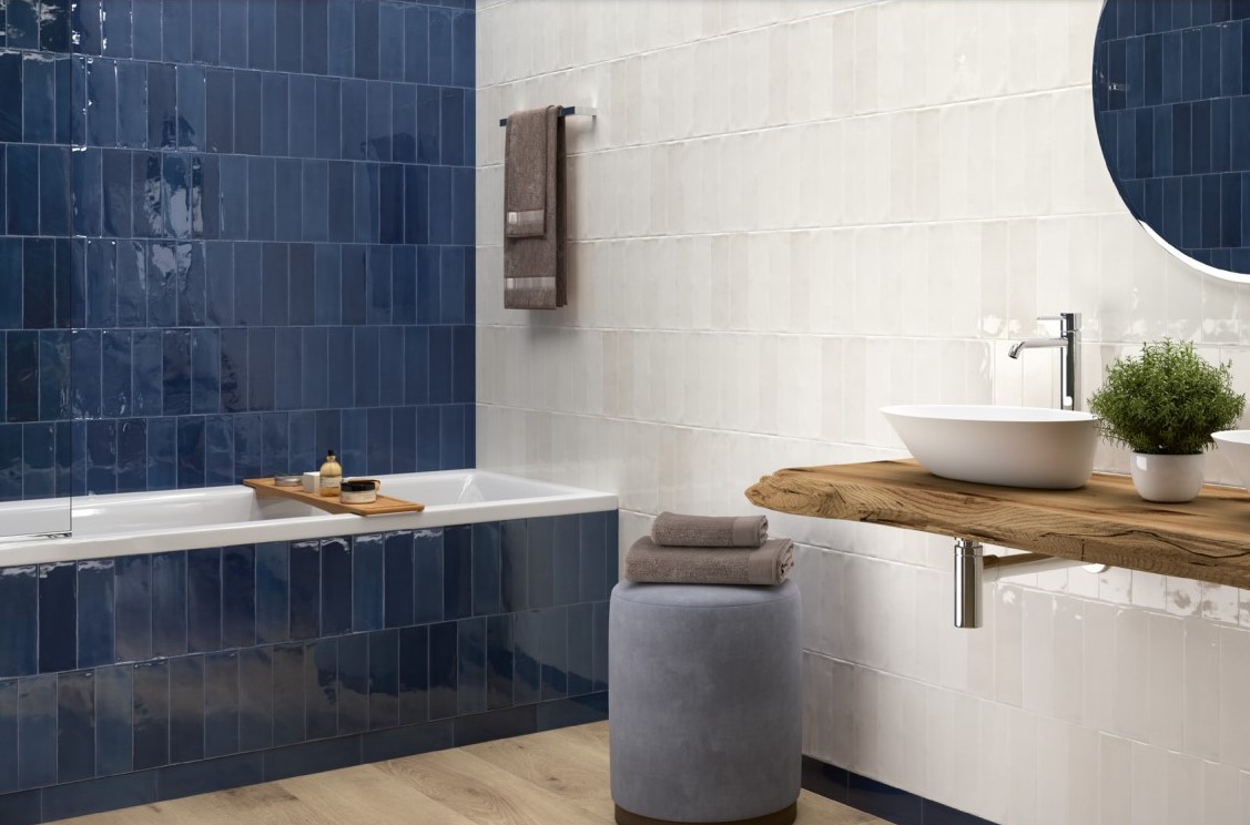
Get the clean, classic feel of subway tile with a fresh modern feel by laying subway tiles in a vertical stack instead of the standard horizontal placement. You can mix and match colours as well to give the room a pop of colour. In the bathroom scheme below, Ca' Pietra tiles are used to create a contrast of colour.
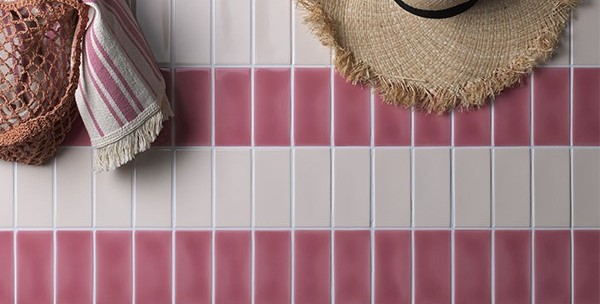
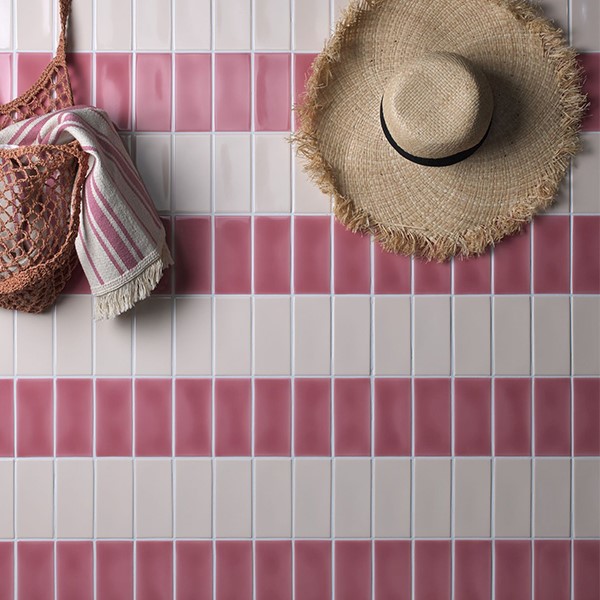
Another idea is to alternate the tone of your stacked Subway Tiles. The pink scheme below is called a 'solider course' in bricklaying speak by alternating the colour tile by tile rather than row by row if you want things to feel especially dynamic.
Dune's Tabarca Marino tile looks stunning in this bathroom in which the subway tiles are laid vertically.
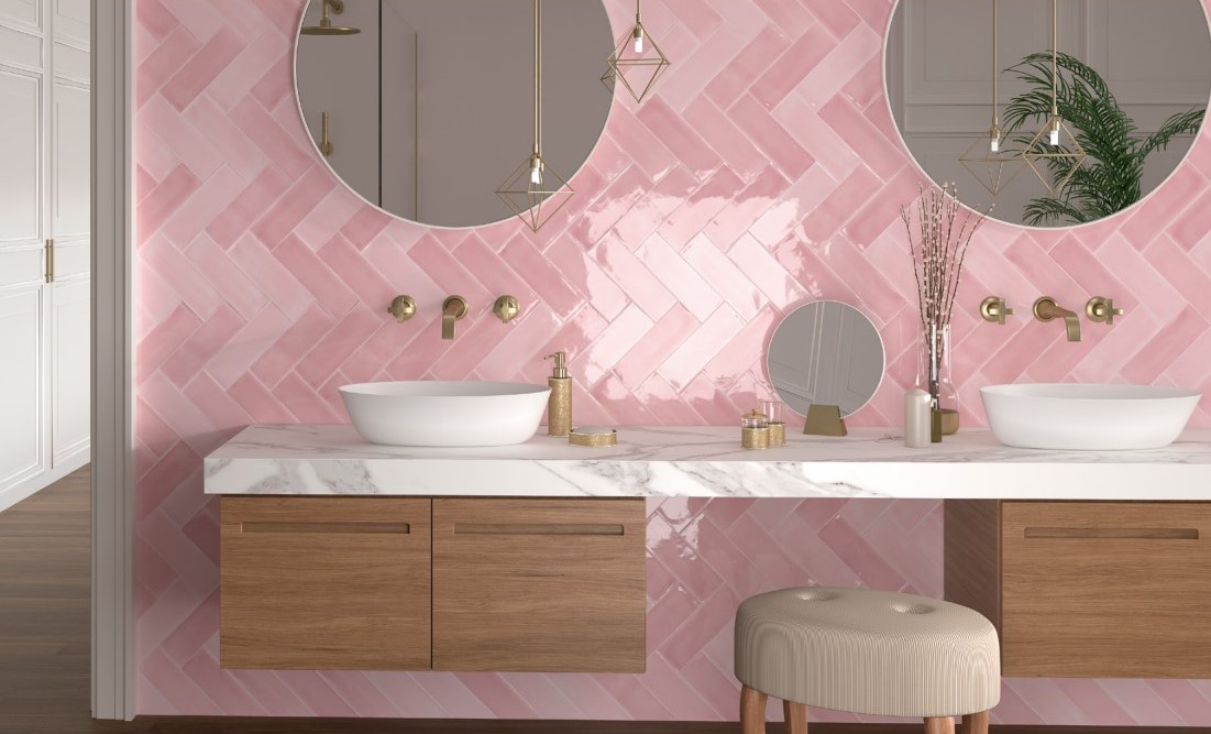
Herringbone pattern
Layout subway tiles in a herringbone pattern to add movement and texture to your space, and guarantee a stylish interior. This pattern creates visual interest and draws the eye up, elongating small spaces.
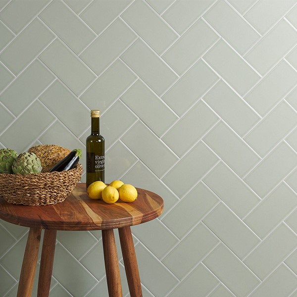
Switch up the colours of your tiles to give you instant vibrancy!
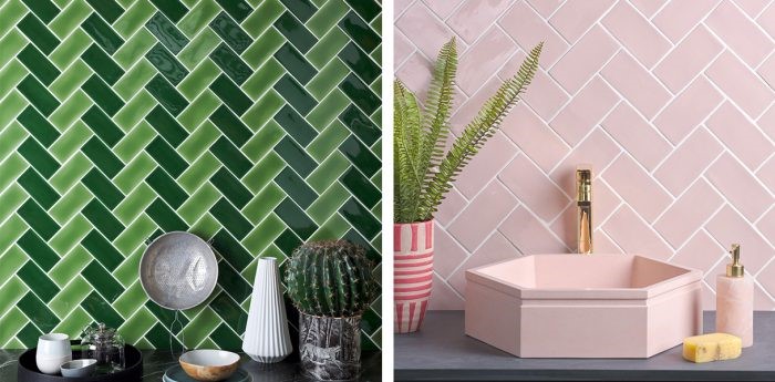
Dune has a wonderful example of a herringbone at 45 degrees, which is a slightly different look to the classic herringbone, but it certainly has its own flavour, and we are big fans!
The basketweave
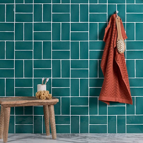
Tile experts at Ca' Pietra love the idea of a basketweave design. A texture-rich pattern that takes its cue from the textile industry where a webbed-like effect comes from interwoven strands of yarn, of fabric or even in furniture where thin sheets of malleable timber are woven like thread, basketweave speaks of strength and solidity.
Below is Ca' Pietra's Seaton Surf Crackle Ceramic tile, which will delight your family your guests!
Our experts here at Real Stone & Tile would love to help you with your next project, so please get in touch or come and visit our Cheshire Showroom!
Most Recent
Having embarked on a major extension for their beautifully renovated and greatly extended home, the Jafar family were keen to ensure that their all four of their bathrooms exuded elegance, as well as...
Having embarked on a major extension for their beautifully renovated and greatly extended home, the Jafar family were keen to ensure that their all four of their bathrooms exuded elegance, as well as...
Real Tiles & Bathrooms is proud to have supplied premium bathroom suites, high-quality tiles and kitchen flooring for a stunning new housing development in Woodford, Cheshire, delivered by long-te...
Archive
- June 2025
- May 2025
- March 2025
- February 2025
- January 2025
- December 2024
- November 2024
- September 2024
- August 2024
- July 2024
- June 2024
- April 2024
- March 2024
- February 2024
- January 2024
- November 2023
- October 2023
- September 2023
- August 2023
- July 2023
- June 2023
- May 2023
- April 2023
- March 2023
- February 2023
- January 2023
- December 2022
- November 2022
- October 2022
- September 2022
- August 2022
- July 2022
- June 2022
- May 2022
- April 2022
- March 2022
- February 2022
- January 2022
- December 2021
- November 2021
- October 2021
- September 2021
- August 2021
- July 2021
- June 2021
- May 2021
- April 2021
- March 2021
- February 2021
- January 2021
- December 2020
- November 2020
- October 2020
- September 2020
- August 2020
- July 2020
- June 2020
- May 2020
- April 2020
- March 2020
- February 2020
- January 2020
- December 2019
- November 2019
- October 2019
- September 2019
- August 2019
- June 2019
- May 2019
- April 2019
- March 2019
- January 2019
- December 2018
- November 2018
- October 2018
- August 2018
- July 2018
- June 2018
- May 2018
- April 2018
- March 2018
- February 2018
- January 2018
- December 2017
- November 2017
- October 2017
- September 2017
- August 2017
- July 2017
- June 2017
- May 2017
- April 2017
- March 2017
- February 2017
- January 2017
- December 2016
- November 2016
- October 2016
- September 2016
- August 2016
- July 2016
- June 2016
- May 2016
- April 2016
- March 2016
- February 2016
- January 2016
- December 2015
- November 2015
- October 2015
- September 2015

